
Table of Contents
How do automotive vinyl warp designers get accredited? There are no professional design courses dedicated to helping students compose more-effective vehicle wrap ads; designers learn on the job. Viny manufacturers like 3M and Avery offer installation classes, but there’s precious little out there in terms of wrap advertising design. The professionals at Sign Source Solution have been doing this work for decades and have built an empiric knowledge. Our designers create effective ads because they know what works. They’re also commuters who’ve experienced both good and bad advertising on the road.
There are many schools for commercial design and many universally accepted rules in a discipline that stretches back to antiquity. Some of those fundamentals can be applied to vehicle wrap ads, and other design concepts might be tweaked to better accommodate this truly mobile medium.
Why Are Vehicle Wrap Advertisements Different?
The primary difference between vinyl wrapped messaging and a similar sized billboard or print ads is movement; some portion of the public is going to see the car in motion, and this presents both challenges and opportunities. The primary challenge is to keep the ad copy legible, so the message remains comprehensible, but the opportunity here is to incorporate the vehicle’s real-life movement in the commercial proposition being presented.
Designing effective ads on automobiles can be a little complex. Any designer who decides to undertake a vehicle wrap project should at least be at an intermediate skill level with standard graphic design programs and be prepared to do more research. Every make and model of car has a vehicle wrap design template, and these can all be secured from ***(where? *** )
There are many different software solutions but at Sign source Solution, we use Adobe Illustrator.
At Sign Source Solution, we’ve been designing vehicle wraps for almost two decades. Our designers work in accordance with the four laws or concepts listed below when creating messages for wraps. Why do these fundamental concepts work? They rooted in human cognition on a near-instinctual level. The rules work because they conform ads to be more analogous to how humans process information.
Four Concepts to Understand for Better Vehicle Wrap Advertising
These four principles might give new practitioners some guidelines by which they can layout their designs and communicate commercial messages more efficiently,
- Rule of Thirds and The Golden Mean
- Focal Point
- Visual Path
- Typography
Lastly there is the opportunity to showcase the vehicle’s actual movement in the advertisement.
Composing Good Car Wrap Advertising
While it’s possible to vinyl wraps with advertising messages on just about any modern automobile, within the Canadian commercial advertising industry, vehicle wrap ads are applied primarily to delivery vans and trucks. This is followed in popularity by pickup trucks with passenger cars being last on the list. This article will therefore concern itself with the treatment of delivery vans and trucks where the primary ‘billboards’ are the two sides of the vehicle.
Working within the confines of prefabricated automotive templates, choose a surface and divide your image into nine equal parts, three vertically and three horizontally (the same as a tic-tac-toe board).
Using these lines as guides, place objects of interest at the intersections of the lines as classical artists learned and proved that this keeps the eye within the picture. This is also how we derive the Golden Rule which is the balance that’s achieved when everything interesting is in the right spot.
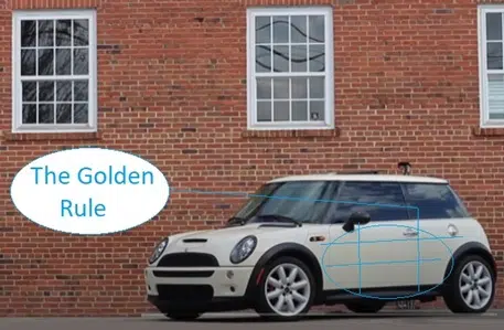
Designers cannot physically re-arrange elements in a photograph. Unless they’re also simultaneously doing photo shoot for the ad, the photography comes as it was shot. But good designers break the images down to iconic elements which they place at the intersections of the lines. The combined visual weights should be proportional, and everything should balance. That’s the Golden Rule.
Advertising agency clients will hear designers talk about weight or balance in their submitted work. This is much easier to see with the lines in place. If you place elements of your photo two thirds to the right or left it again generally becomes more pleasing to the eye. If presenting landscapes, try placing the horizon two thirds of the way up or down.
Single Focal Point Ads
It’s a busy world out there and sometimes it’s better to stand apart from the crowd and be quietly different. By simply providing an incongruous image with a curious character at the focal point, this Mexican restaurant and catering company makes a memorable first impression on drivers and event goers that encounter their delivery vehicle. The ad works because the bandito has real bandoleros strapped across his chest and viewers look close to find every single bullet is in sharp focus. The iconic individual captures the human eye and holds it ransom until the brain resolves the image’s meaning.
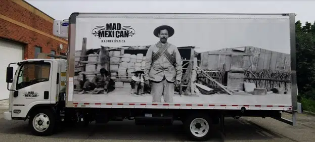
The background is a Mexican settlement which appears well provisioned with a vender doing business, and so the viewer correctly concludes the ‘mad Mexican’ represents that culture’s curious hospitality.
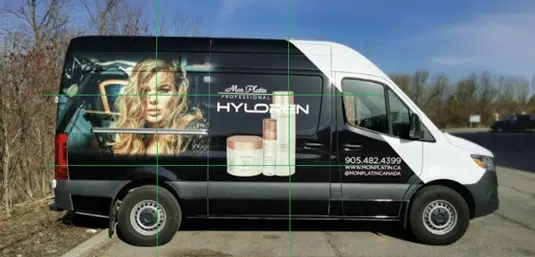
Plotting Viewer’s Visual Path Through Multiple Focal points
The example above used only one focal point, but many ads have more than one idea to communicate and so they must layout their messaging with two or three points of interest. The ‘visual path’ is the journey that the viewer’s eyeballs must take to move between the elements. Good designers know that whatever they see first will shape how they perceive the next bit and so on and so forth all they way down the presentation.
When ad consumers ponder visual graphics, whether it’s printed, on television, or a web page, they will follow a visual path. The advertising industry in general and car wrap designers more specifically must know there are two notable shapes; the first is a Z shape, in which the human gaze starts at the top left, moves towards the right, and then zigzags diagonally to absorb all significant information. The second cognitive shape is an F. The F pattern is like the Z behaviour, but instead of returning to the left on a diagonal down, it follows lines more akin to how readers digest a block of text. One the secrets to designing good ads is to force viewers’ brain to automatically adopt one or the other pattern.
The photo below shows a sloping visual path. Viewers’ eyes move from the circular logo through the brand name and down to the turquoise-coloured swimming pool on the front wheel well. Its conceivable that by the time the viewer sees the uniquely coloured shape they’ll have already realized it’s a swimming pool and the satisfaction of seeing and understanding the image’s message will help reinforce the company’s name in their minds.
Typography
Unlike stationary billboards, messages printed on vinyl vehicle wraps travel the Earth at 100 kms per hour and at such speeds many viewers will only catch a fleeting glimpse of the advertisement.
Given the speedy nature of the mobile medium, it only makes sense to choose the most readable fonts and make the typography as large and impactful as possible. The example below is rather clever and probably quite effective because it’s so simple.
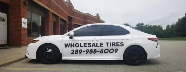
The wholesale tire retailer is all-business, and the decidedly Spartan design reinforces the company’s direct to consumer approach.
Incorporate the Dynamic Action of the Vehicle’s Movement in the Wrap Design
Drivers can have profound experiences on the road and be greatly impacted by marketing because they are essentially held captive behind their steering wheels. A crowded highway can become an intimate ad-delivery theatre with the right presentation. Imagine hurrying along and looking left to find you’ve been overtaken by someone standing upright in a shopping cart?
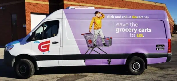
The grocery delivery business seen below has created advertising that’s designed to intrigue any potential consumer they encounter on the road because of their use of Dynamic Action. The word ‘grocery’ in the messaging really stands out because of its positioning alongside a picture of their ideal consumer speeding along in a shopping cart. It all works together to perfectly suggest a fast grocery delivery service. Humans don’t really need to read anymore to understand the message and value proposition.
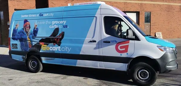
When it comes to vehicle wrap advertising, the idea of exploiting dynamic action is similar to the cinema. Both are moving pictures in that respect. You see the female in the advertisement above is seen ‘in motion’ even when the delivery van is stationary. Dynamic action is what makes movies seem so real.
In the year 1895 Auguste and Louis Lumière staged a showing of motion pictures. to a paying audience at a Parisian cafe. 'Arrival of a Train at La Ciotat' is perhaps the first motion picture in modern history. (Although original shot as more an experiment, it shows a train arriving at a passenger station). Popular legend has it that, when this film was shown, the first-night audience fled the cafe in terror, fearing being run over by the "approaching" train. That’s dynamic action at work.
All of the visual communication techniques explored above are regularly employed by the vehicle wrap advertising designers at Sign Source Solution. Please submit your ideas for a free estimate.