Sign Source Solution

Design and Development Process

Home » Design

Design is an important element of any sign. Your sign should solve the problem for which it was intended. The function of design is to capture attention, inform, create or support an image, and elicit an emotional response. Design can be simple, elegant, conservative, flashy or wild… Design is about selling your message in a creative yet appropriate way for your business.

Book a Consultation


    Custom Design Layout

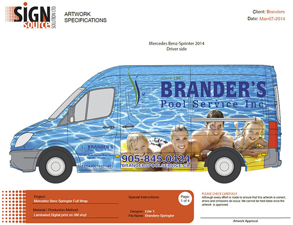
    Here is an example of a custom vinyl wrap we did for a van. We sourced the photos, did the design and created and installed the wrap. What better way to promote your business? To see how this design looks like of the finished van, see Custom Van Wraps.

    Colour and Font

    Colour and font style are important aspects of sign design. We can reproduce a design or logo you already have, or we can create an original layout just for you. A graphic on your sign will catch the reader’s attention and add flair to your signage. The font used should be appropriate to the message you have to convey. They can be big and bold or soft and flowing.

    When choosing the colour for your lettering, you need to think about the sign background colour, as a good contrast will allow for easy reading. Keep in mind:

    Red – SCREAMS for attention

    Green – healthy life style

    Blue – calming aura

    Brown – conveys masculinity

    Black – is always sophisticated

    When choosing colours and backgrounds, it is very important to choose the right combinations. Are your signs using the correct contrast that will provide the best and the most effective results? Here are some options and how the different combination looks like which will make it easier to decide on the colour combinations to be used:

    Are your signs using the correct colour configuration to get the best results?

    Images

    We all know that a picture is worth a thousand words and it’s never truer than with signs. Pictures elicit emotion and involvement much faster than letters. By adding a full-color picture and graphic to an outdoor sign, a vehicle, a window can add realism to your message.

    Text Size

    How big should the letters be? The industry standard rule of thumb is 1 inch of letter height for every 10 feet of viewing distance, although there are other variables that could be a factor like font and lighting condition. Sign source Solution can help you find the most effective size for your sign.

    Materials

    Depends on your budget and how long you are planning for your sign to last, it will help us determine which material will be the most cost effective to use, while conveying the intended message. Sign Source Solution can offer you a temporary or permanent sign solution. The choice of material recommended will also depend on the application and location of the sign, sign codes, environmental factors, etc.

    Sign Source Solution graphic designers can work with you to bring your idea to life or we can start from scratch, or we can work from your layouts.

    Please note – if you need something that you do not see listed on our website, than call us to discuss – we love talking signs. 647-933-7446

    Please refer to the file below for specifications when submitting your artwork.

    Artwork Submission Specs

    Technical Specifications Copyright Information

    The drawings, including technical specifications, remain the property of Sign Source Solution and shall not be reproduced, copied or used for manufacturing without the written consent of Sign Source Solution.
    See some of our drawings and technical specifications.

    Use the button below to Pay with PayPal

    client testimonials

    read all testimonials

    Subscribe to our signage insights

      COPYRIGHT © 2013 - . ALL RIGHTS RESERVED.
      linkedin facebook pinterest youtube rss twitter instagram facebook-blank rss-blank linkedin-blank pinterest youtube twitter instagram