Table of Contents
At present, in the marketplace today, there’s a clear and recognizable branding trend toward informality. This phenomenon is personified in website chatbots, saucy email newsletters, and irreverent advertising, and by companies that now refuse to capitalize the first letter of their corporate brand name. Fortune 500 firms like Amazon, eBay, Facebook, Flickr, Intel, Citibank, Macy's, BP, Vitamin Water, and Xerox all have branding sans-caps. Add to that list the legendary toy company Fisher-Price which spells its name without capital on all its toys and marketing.
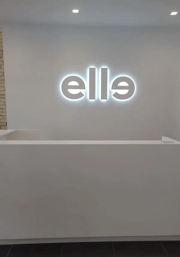
Plenty of Canadian companies have also selected corporate logos made entirely of all-lowercase letters and so in this respect, Elle Fitness, and Social is simply following a trend. But unlike some of those other entities, they have a good reason to cultivate informality and by reversing the second ‘e’ in their four-letter logo, they’ve created a symmetrical moniker that’s very on-brand, unique to their enterprise, and highly memorable.
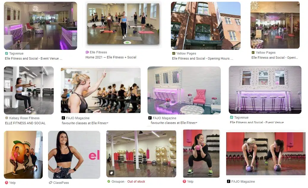
Elle Fitness and Social’s four-letter logo is their new reception area lobby sign, and the design encourages informality because they sell a social element in addition to physical fitness. They cater to style-conscious females who are urban professionals living in the condos on King Street in Toronto. Their enterprise is built on selling comfort, and style – an informal workout with friends in a cozy gym with hardwood floors, white walls, and pink furniture. A Google image search shows what the business is all about.
The company’s website boasts of them having amazing instructors with the knowledge and the ability to motivate, and how they offer a variety of classes utilizing diverse equipment with different styles of training so members cannot plateau and will therefore never grow bored.
First impressions matter. Their reception area is a likely first point of contact for visitors who may be considering membership. Having such an impressive lobby sign helps create a positive first impression. It’s extra important the sign be impressive just so the occupants of this space feel like they’re part of something cool. This is one situation where a lobby sign is very public-facing and will impact hundreds of people, members, and visitors, every day.
What is this lobby sign made of?
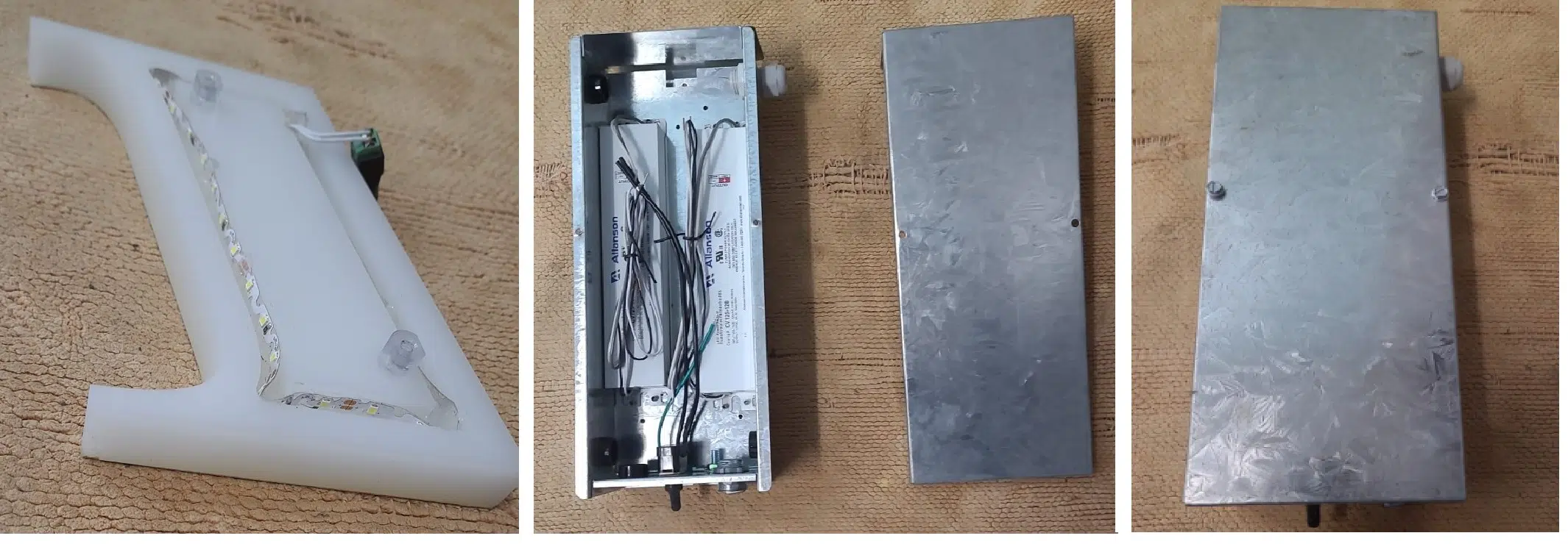
Elle Fitness and Social’s lobby sign has a three-dimensional appearance created by mixing translucent and opaque plastics. The letters have inch-thick acrylic faces, colored white, each has grooves carved in the back that are stuffed with light-emitting diodes. This illuminates a translucent element underneath which results in each letter having a surrounding glow and the sense of elevation, as though it’s hovering on the wall.
During daylight hours, the sign appears white on white and looks very sleek in its modern interior. There are no wires; everything is powered through the wall. We accessed the interior of the wall itself thru a ventilation cover and hooked up everything behind the visible surface.
We made small holes behind the letters to run the wires. All lines run to a metal box deposited in the wall in which we placed the transformers and power supply. This in turn was supplied with electricity via a lamp cord to a standard wall plug which exits the wall near the AC electrical outlet behind the front desk.
Power factor is a measure of how efficiently the electricity is delivered to a lighting fixture. LED ballasts with high power factors are more efficient, which means they use less energy and produce less heat. The heat and power are of small concern in this deployment, but it’s an important consideration in settings where large numbers of LED fixtures are used, such as pylon signs or storefront signage.
If someone catapulted into the wall, would the letters fall off?
Not likely. The sign installers at Sign Source Solution used long threaded screws. To remove the sign is an endeavour. Someone would have to wiggle each letter quite vigorously. Signs that fall off the wall are unsafe and could be a concern in an athletic space where people are inclined to throw things and where someone somersaulting into a wall would not be so extraordinary.
LED Signs Have Improved, Again
LED (light-emitting diode) lighting technology has been rapidly evolving over the past few years, and LED ballasts are one area where there has been significant development. LED ballasts are electronic devices that regulate the AC current and voltage supplied to an LED lighting fixture, ensuring that it operates at its optimal level.
LED Ballast Improvements include:
Wireless control: Many LED ballasts now come with wireless control capabilities, allowing users to adjust the lighting levels from their smartphones or other devices. This makes it easy to customize lighting levels for different purposes and to conserve energy.
Digital ballasts: Digital ballasts are more efficient and flexible than traditional magnetic ballasts. They use advanced microprocessors to control the current and voltage supplied to the LEDs, resulting in higher efficiency and better performance.
Dimming capabilities: LED ballasts now come with built-in dimming capabilities, allowing users to adjust the brightness of the lights as needed. This is particularly useful in settings where different lighting levels are needed at different times of the day or for different purposes.
Integrated sensors: Ask Sign Source Solution about the new LED ballasts which come with integrated sensors that can detect motion, ambient light levels, and other factors. This allows the lighting to be automatically adjusted based on the environment, resulting in greater energy efficiency and improved user comfort.
Overall, LED ballasts have come a long way in recent years, and these technological developments have made them more efficient, versatile, and user-friendly than ever before. Contact us and let’s see about redesigning your interior lobby sign.


